Posts

Showing posts from December, 2017

Kikk Festival

Image
Kikk  is a website I found on the AWWARDS website. First off I have to say this is the coolest landing page I have navigated. The imagery and animation is stunning. Its colorful, uses clean typography, and shows its information in such an amazing way. The responsive of this website is perfect. If I was an employer and someone came up to me with a website like this, wow, they would be hired on the spot. I love how the website has pretty much a story with the gorilla underwater and as you scroll down you go deeper under water. I think that was very creative. Overall I think the whole website was very creative and well done.

Tennis

Image
Tennis  is a website I found on the AWWARDS website. This website received honorable mention and I can see why. The design have a unique landing page that combines black and white imagery with high contrasting colors. I think that this landing page does a great job at getting you intrigued. For the Navigation bar i really enjoyed the responsiveness. It features a bright color that stands out and that makes it easy to navigate through the page.

Hideout Lodge

Image
Hideout Lodge  is a website design that I found on the Awwards website. The design is very interesting because of its very dynamic. It uses many transitions from page to page depending on where you click on. The website features a lot of stunning photography. The thing that I have noticed with many of these website is that many of them use professional high-quality photography. I think that has a very very big impact on whether a website looks good or not. This website does that. It keeps everything clean and uses minimal colors to give a modern adventurous feel.

SEASON

Image
Season   is a website I found interesting on the AWWARDS website. The website features high quality imagery, interesting animations to text, and much responsiveness. The website does a great job of keeping its imagery still readable when shrunk down. I think if I were to one day find a job in a sports company having a website design like this would definitely stick out. The website is very clean and easy to navigate. It was nomimated on the AWWARDS website because of its design.

Triangle Eye

Image
The Triangle Eye lasik eye surgery website was one of the website I used as inspiration for the PIFI website but didn't upload. I wanted to get back to it because I think the website I designed ended up looking a bit similar to this. Black and white imagery, a contrasting color, and its easy to navigate for information. One thing I really liked about this website is the Dr. Smith grid section on the landing page. I think its very well done and very easy to read. Along with that the website also shrinks down to mobile version very well. Another thing that stuck out to me that I want to include in future websites is the CALL button on the nav bar when on mobile. This can be very helpful and user friendly because usual when people are searching a website on a mobile it is to contact them and that makes it way easier than having to look through several pages.

Kaus

Image
Kaus is a brazilian website that I came across when researching for inspiration. The website is very responsive even when shrunk down to mobile version. I can't understand much of the language but that doesn't matter because I am looking at all the brilliant things the designer did to lay all his information out. The designer used a lot of grid layouts and colorful imagery. I think he did a great job on the landing page because it is what really caught my attention. It reminds me a lot of Hilary Pope's style. I enjoy how minimalistic the navbar is in comparison with all the other items in the page. It makes the other elements pop more but you still know the navbar is there.

In-Pieces

Image
In-Pieces is a website I found on designforfounders.com.  The website is about the species that are struggling to survive and I think the design of the website does a great job of keeping you intrigued and wanting to see what other animals are endangered. The website features a lot of illustrative polygonal shapes and it works very well. The animations of the polygonal shapes and how they transform into different animals is very well done.The website isn't cluttered with information but it uses a lot of soft colors and empty space which make the information available seem relaxing. This website also reacts pretty well when shrunk down to mobile size.

Animal Made

Image
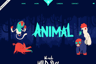
Animal made  is a illustrative website that I found very interesting and is probably one of my favorite websites so far. I found this website as a Facebook link. The websites color choices are very vibrant and attention grabbing. What I like most about this website is the way it tells a story and the various forms of animation and responsiveness. The navbar for this website is so cool. Its animated and I have never seen anything like it. Overall the website is very playful and uses a great color choice along with playful fonts. I hope to be this good at website design some day because this seems like its crazy hard and time consuming!

Adventure

Image
This is a website I found on Vimeo that really caught my attention. The website uses a lot of imagery and sliders which I really thought were cool and worked perfectly for the website. In a website especially about adventure you want to include the many types of adventures and I think this website does a great job of showcasing that. I enjoyed the responsiveness and clean feel. I think if I were to work on my restaurant website and wanted to include at the many different ways to display food photography, I would definitely use this as inspiration. Here is a link to the website .