Posts

Showing posts from September, 2017

Go Kart Labs

Image
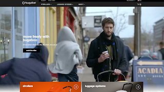
Go Kart Labs  has a nice clean website design that caught my attention. It uses video on the home page and has a easy to navigate layout. In terms of color the website is mostly black and white but uses one bright color to contrast and I think it works very well. The navigation is easy to read and easy to find information. I think this a well made design. I found this design on  10bestdesign.com

B2B Technology

Image
B2B technology  has an website that also caught my attention. I enjoyed this website because of its layout, color palette, navigation bar, and a few others. If I changed anything about the website it might be the type size. However for some reason that is another reason why it caught my attention and I don't really hate it. I think its memorable because of how big the type size is. I dont know maybe its just me. I found this website on  Thebestdesigns.com

Nobbys Lighthouse

Image
Nobbys Lighthouse  is a website that I enjoyed browsing through because of its simpleness. Its clean and elegant. I enjoyed the overall layout of the design and the way information is distributed. I also really really liked how the website reacts when shrunk.  It still keeps that clean format and is just as nice. I don't think I would change anything about this website. I found this design on  TheBestDesigns.com

Bugaboo Strollers

Image
An interesting website I found for a store is B ugaboo . The website is easy to navigate and pretty responsive. I enjoy how its clean and not filled with ads. I also enjoy how the products are 360 degrees. When trying to get a full look at them they have a rotation bar under and I think that can be very beneficial for many other stores to use. If I owned a store this would be the type of website I would like to have.

Make Your Money Matter Website

Image
You can find the illustrative website  here.  I wanted to post a different kind of website than what I was used to seeing. This website uses mostly illustration in their design. Its actually quite cool how they tell a story when scrolling down. They kept a pretty consistent color palette even when you arrive to the main websites page and get past all of the story telling. I had never seen anything like it. It is definitely a creative site which I have no idea how it was done but it caught my attention.

Hi. Drive-In

Image
Hi. Drive-in, or Hi-Pointe Drive-In has a website that I enjoyed browsing through. The restaurant features imagery and a diverse layout I hadn't seen. One of the things I enjoy the most about this website is the responsiveness when shrunk down. The tabs stack and become easy to read and interesting.

Forix

Image
This is a website design I found when looking for inspiration for my design. I thought I should include it in my blog because it is a website design I hope to be able to do once I finish the class. The website is Forix . The reasons I liked the design was because it was easy to navigate, simple, and is responsive. I like the color of the design but I would like to see this website in other color choices as well, although the white background does give a better contrast, I'm wondering what it would look like if the background was black? I don't know but I like it anyways!